Making contact forms in English (Part 2)
This is a loosely translated and shortened English version of a Japanese article from the CJ Column.
English sites made in Japan
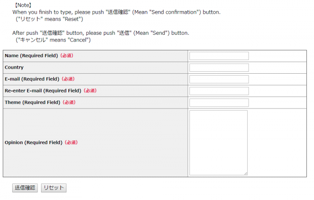
The first part in this series focused on one of the problems often found in English contact forms created by Japanese companies. In Part 2, we take a look at some other related problems.The image below shows an English contact page from an English website made in Japan. Can you see some of the problems?

The presence of the reset button, as mentioned in the previous article is one problem that should be removed. But there are more problems as well.
The most obvious problem is that the buttons on the bottom are written in Japanese.
This is not going to help users who can only read English.
There are English explanations of what the 'Reset' or 'Cancel' buttons mean at the top of the form that would be more helpful if placed next to the buttons.
But wouldn’t it be more user-friendly to simply label the buttons in English?

TN Coordinator


