Designing overseas websites Part 3
This is a loosely translated English version of a Japanese article from the CJ Column.
Japanese production companies face a rising demand for localized websites targeting users abroad. In this article, we introduce three points worth noting when producing such sites.
Point 1 Showing figures
Many foreign companies prioritize website pages that focus on performance figures when evaluating potential business partners. Such clear evidence of achievement dramatically supports branding efforts. But westerners prefer to see only a few numbers presented in appealing visuals such as infographics that can be understood in seconds. They tend to overlook complex tables filled with numerical data, such as those that appear on many Japanese sites.
Point 2 Choosing base colors
In recent years, flat design has become a mainstream approach to website design. Since this minimalist approach employs an extremely limited color palette, localization of the main color (which dramatically affects the overall impression) must be carefully considered. For example, research shows that a gray and blue combination gives Japanese a strong impression of trust and stability, but does not give westerners a very positive impression.
Point 3 Choosing fonts
In general, Westerners prefer the use of a single font per page, or a maximum of two fonts that appealingly complement each other. Japanese, however, tend to intentionally use very different fonts for the headline and body copy to differentiate the information. Westerners find this practice puzzling, unattractive and hard to read because they are accustomed to using different font sizes and font weights to differentiate text content.
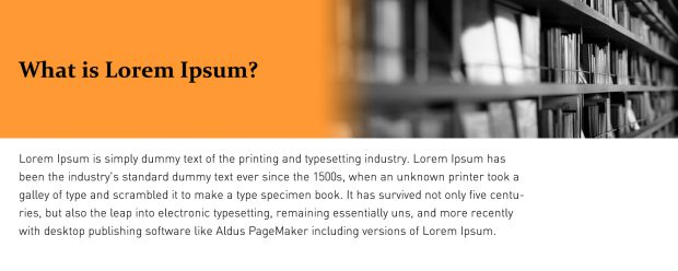
An example of different fonts in the title and body copy
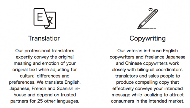
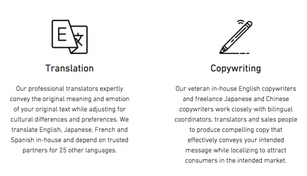
It is also worth noting that Japanese fonts, such as MS P Gothic, make alphanumeric text inappropriately larger than western fonts. When converting Japanese text to English text in a layout, be sure to change the Japanese font to a Western font in every case.
MS P Gothic (Japanese font)
DIN (English font)
As you can see, cultural differences should be taken into account when producing websites for use abroad. Localizing the design is one important way to make your client look good in foreign markets.
YN Web Director


