オーストラリア発 Digital Discovery ― 次世代を見据えた映像・SNSの活用 ―
 |
|
http://onholiday.hollersydney.com.au/
http://www.facebook.com/hollersydney?v=info
日本のウェブ業界で、海外出身のクリエイターとして働く私は、職業柄、デザイン性やユーザーインターフェースといった視点で最新のウェブ動向をリサーチすることが多々ある。今回は、そんな中で私が出会った魅力的なサイトを紹介したい。ロンドンとシドニーにオフィスを構え、数々のデジタルコンテンツ制作を手がけてきた会社のものである。
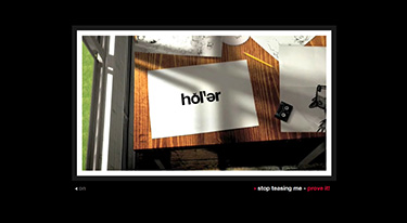
『Holler(*原意: 叫ぶ、呼びかける)』という一風変わった名前を持つこの制作会社のサイトは、私たちクリエイターが理想とするような、魅力的なコンテンツやブランディングの手法をふんだんに取り入れており、観る者が思わず真似したくなるような内容である。
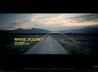
何といっても特徴的なのはイントロである。1分半にも及ぶ映像が、この制作会社の強みや可能性を訴えかけてくる。この独特のカメラワークとスピード感で展開する映像の前には、月並みな会社概要や紹介文は必要ない。実に“うまい”導入だ。一般に、サイトを次々に渉猟してしまうユーザーが多い中(平均閲覧時間はたったの30秒といわれている)、気付けば私はこのイントロを5回も繰り返し見ていたのである。
ここで本サイトのデザインレイアウトに視点を移したい。ここには紙媒体の広告デザインで培われた経験が強く活かされている。グリッドを取り入れたマルチコラム式のレイアウトは、視認性とユーザーインターフェースの向上に大きく貢献していて、ユーザーは迷うことなく自分の興味あるコンテンツを探すことができる。シンプルなインターフェースに加え、独自のアイコンを使用することで更に使い勝手は増している。コンテンツが充実しているにも関わらず、ここまでの見やすさを保持できることは滅多にない。延々とスクロールしなくてはならないサイトが多い中、このサイトから学ぶべきことは多い。Web 3.0を予感させるような手法を取り入れた、創造性にあふれた制作会社ならではの作品である。
サイト本体にも注目してみよう。思わず先を読ませたくなるような充実したコンテンツが並んでいるが、それは「見せ方」そのものにこの制作会社の知見が反映されているからこそだと思う。その特徴的なアプローチは以下の通りだ:
- ・シンプルで分かりやすいレイアウト
- ・キャッチーで簡潔なヘッドラインの使用
- ・オリジナリティー溢れる記事
- ・読みやすさを考慮した編集術
コンテンツの中では、特に「ケーススタディ(Case Studies)」は一見の価値ありだ。中でもこの制作会社が開発から手がけ、その腕前が発揮されている例としてRed Bull Reportを紹介する。
http://www.redbullreporter.com/
ユニークなCMでお馴染みのレッドブルのキャンペーンサイトだが、このサイトのウリはユーザーがコピーライターやカメラマンまたは映像制作者として、レッドブルのイベントを紹介できる点にある。このサイトを通じて、ユーザー登録をはじめ、コメントの掲載や制作物のアップロード、またその評価などを行うことができる。つまりは、レッドブルが主催するイベントやワールドクラスのスポーツイベント、最先端の音楽やカルチャーなどを取材するというインセンティブが与えられるのである。
最後にもう1点特筆すべきは、『Holler』のサイトがSNSと連動していることである。かつては一握りのユーザーが友人とのコミュニケーションに使用していただけのSNSも、今や企業のマーケティング戦略上の重要なツールとなっている。『Holler』は自分たちのフェースブックアカウントに、最新のポートフォリオやビジネスネットワークを掲載し、1100以上もの評価(=いいね!)を獲得している。最新のウェブ動向を見事に自分たちのものとして活用した好例といえる。『Holler』のソーシャルスペースでの存在は今後もさらに増していくだろう。
サイト上で求められるデザインのトレンドはその変化が著しく、常に学ぶことが多いのも事実だが、一方で、様々な企業サイトが新しいメディアや動向を取り入れていく様を目にするのは、クリエイターにとって強い刺激となるのである。
みなさんも、ぜひ見てね!!
Digital Discovery - Australian-style
|
|
http://onholiday.hollersydney.com.au/
http://www.facebook.com/hollersydney?v=info
As a foreign creator in the Japanese web design industry, I often review websites in search of new trends in web marketing, aesthetic feel and user interface. During one of these searches, I came across this website for a digital agency with offices in London and Sydney.
Holler, despite the strange name, provides a great example of what we as creators strive to accomplish - deliver engaging content, make brands famous and inspire a following.
Intro. Intro. Intro. This engaging introduction defines the company’s work and communicates the sites’ tone in a very creative way. While the average time a visitor spends viewing a website is 30 seconds, I replayed this 1-minute intro 5 times!
Whilst reviewing this site I felt a strong print design influence - high impact that grabs attention and communicates clearly. Although the grid system is not new, Holler took full advantage of this existing system and created a multi-column web design layout for easier page viewing. The layout is very clean and is a good replacement for the busy and complex web designs often seen in past years. Although there is a lot of content, a customized single page layout/non scroll view rule has been successfully followed. The user interface is simple and clean with a good use of customized icons. It also has a modern web 3.0 feel, which enhances the website tone and feel as might be expected of a digital agency.
The web content was good and contained relevant information, driving me to read more and explore the site from one page to another. I thought the web content could be characterized as: Well-written・Brief and concise・Interesting and Entertaining・Original and Unique・Relevant and Attractive Headings. The Case Studies section is a must read and can be viewed by random, by date or by client. I have chosen one to showcase their talent from development to solution.
Red Bull Report
http://www.redbullreporter.com/
Holler conceived and created Red Bull Reporter for Red Bull. The initiative gives wannabe writers, photographers, film makers and presenters the opportunity to travel the world reporting on Red Bull events. Holler designed a built a website that encourages users to sign up, select a brief and upload a response to be rated by their peers. The ultimate incentive? Being selected to cover one of Red Bull’s many exciting assignments, covering world-class sports, cutting edge music and innovating culture events, worldwide.
There is no hotter trend in the internet, marketing and media space than social networking. What started out as a way for 'cool kids' to talk to each other has now become an essential part of every company's marketing strategy. Holler have jumped onto the trend and their facebook page showcases their recent work and business networking presence. With 1095 likes on facebook, admiration for the company now flourishes in social space. (Note; current website under renewal)
Revolutions in web design happen very rapidly and seeing a company showcase new media and aesthetic trends so well is an inspiration to me. Mite ne!!!