|
http://onholiday.hollersydney.com.au/
http://www.facebook.com/hollersydney?v=info
As a foreign creator in the Japanese web design industry, I often review websites in search of new trends in web marketing, aesthetic feel and user interface. During one of these searches, I came across this website for a digital agency with offices in London and Sydney.
Holler, despite the strange name, provides a great example of what we as creators strive to accomplish – deliver engaging content, make brands famous and inspire a following.
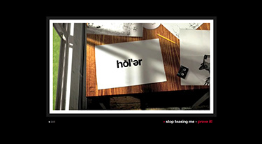
Intro. Intro. Intro. This engaging introduction defines the company’s work and communicates the sites’ tone in a very creative way. While the average time a visitor spends viewing a website is 30 seconds, I replayed this 1-minute intro 5 times!
Whilst reviewing this site I felt a strong print design influence – high impact that grabs attention and communicates clearly. Although the grid system is not new, Holler took full advantage of this existing system and created a multi-column web design layout for easier page viewing. The layout is very clean and is a good replacement for the busy and complex web designs often seen in past years. Although there is a lot of content, a customized single page layout/non scroll view rule has been successfully followed. The user interface is simple and clean with a good use of customized icons. It also has a modern web 3.0 feel, which enhances the website tone and feel as might be expected of a digital agency.
The web content was good and contained relevant information, driving me to read more and explore the site from one page to another. I thought the web content could be characterized as: Well-written・Brief and concise・Interesting and Entertaining・Original and Unique・Relevant and Attractive Headings. The Case Studies section is a must read and can be viewed by random, by date or by client. I have chosen one to showcase their talent from development to solution.
Red Bull Report
http://www.redbullreporter.com/
Holler conceived and created Red Bull Reporter for Red Bull. The initiative gives wannabe writers, photographers, film makers and presenters the opportunity to travel the world reporting on Red Bull events. Holler designed a built a website that encourages users to sign up, select a brief and upload a response to be rated by their peers. The ultimate incentive? Being selected to cover one of Red Bull’s many exciting assignments, covering world-class sports, cutting edge music and innovating culture events, worldwide.
There is no hotter trend in the internet, marketing and media space than social networking. What started out as a way for ‘cool kids’ to talk to each other has now become an essential part of every company’s marketing strategy. Holler have jumped onto the trend and their facebook page showcases their recent work and business networking presence. With 1095 likes on facebook, admiration for the company now flourishes in social space. (Note; current website under renewal)
Revolutions in web design happen very rapidly and seeing a company showcase new media and aesthetic trends so well is an inspiration to me. Mite ne!!!
